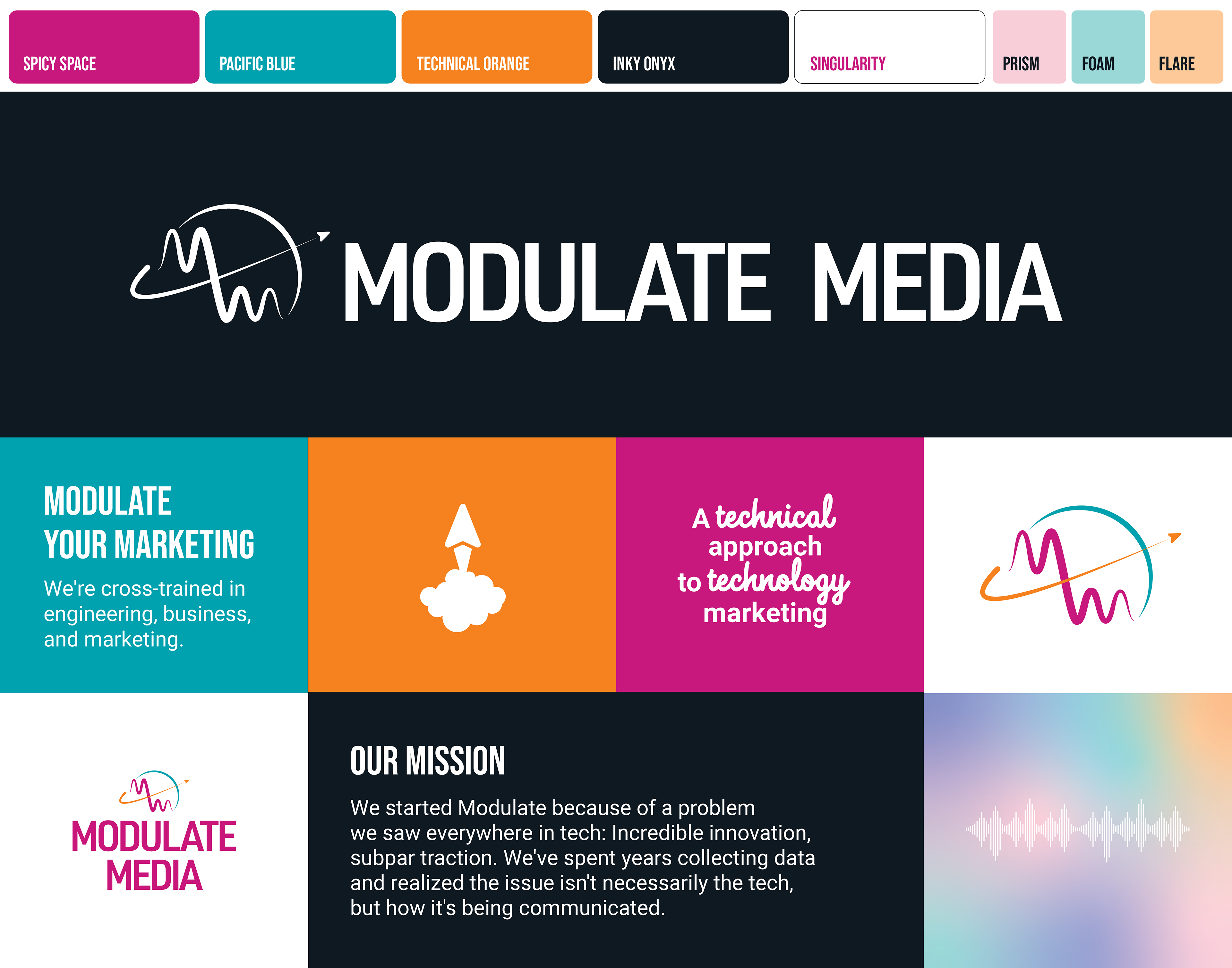
visual identity | Colors | Typography | BUSINESS CARDS | Website design
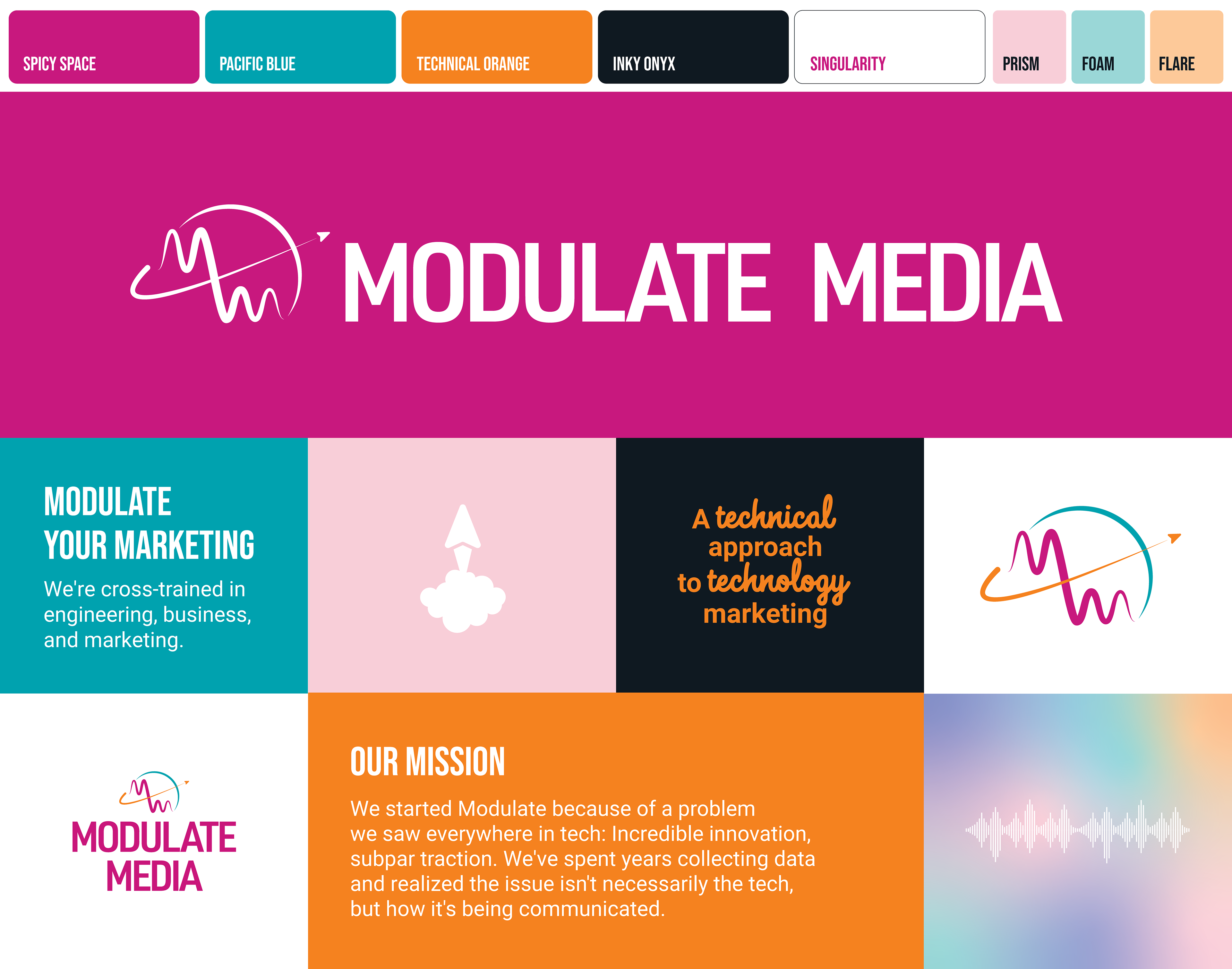
Branding Modulate Media was one of the most fun projects I've worked on. As a marketing agency that set out to cater to aerospace and deep tech industries, the team wanted something that would stand out against the darker color palettes of that demographic. I also knew I wanted to create a logo that was clever and tapped into the technical aspects of our expertise with a color palette that was vibrant, modern, and eye catching.
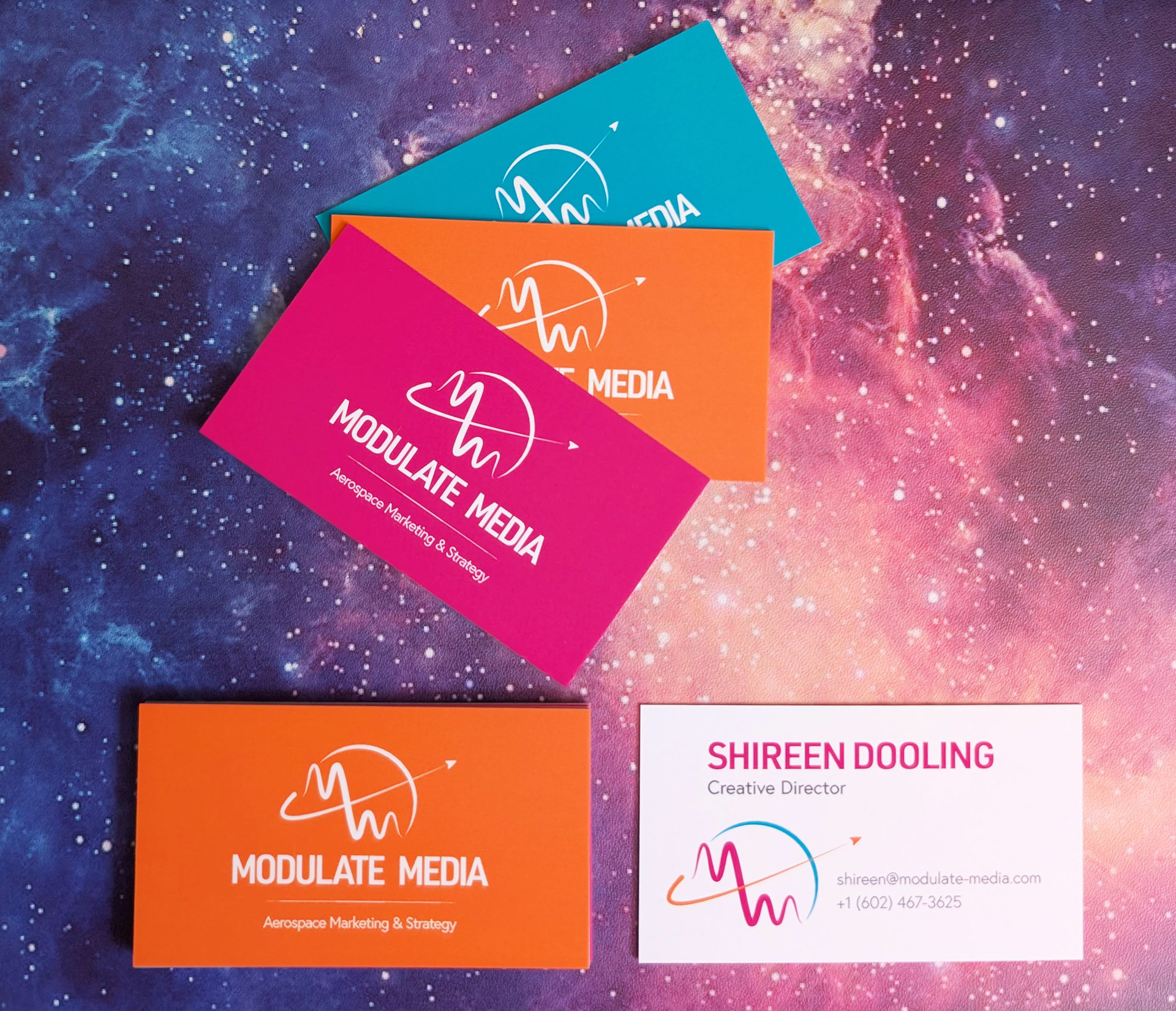
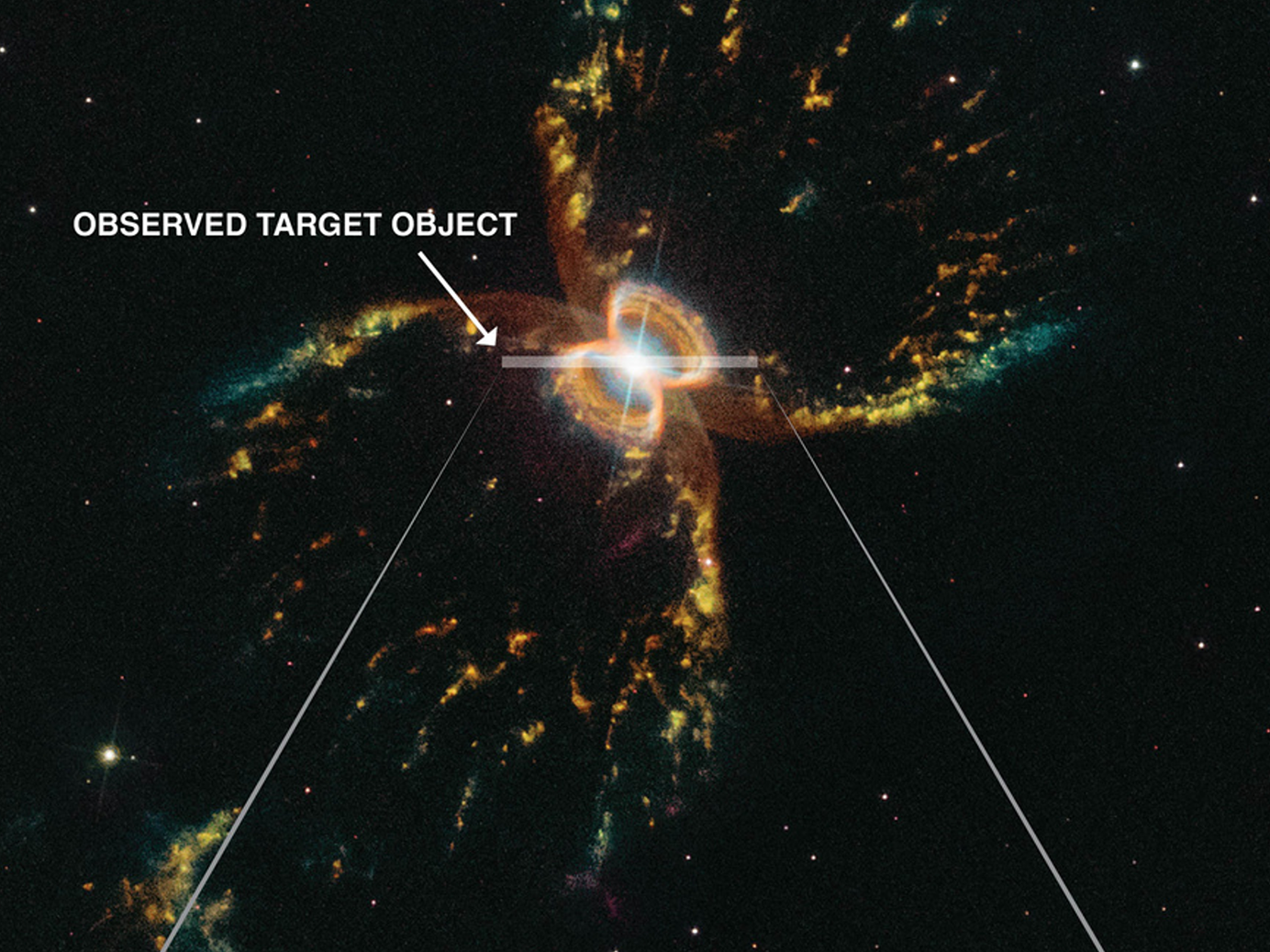
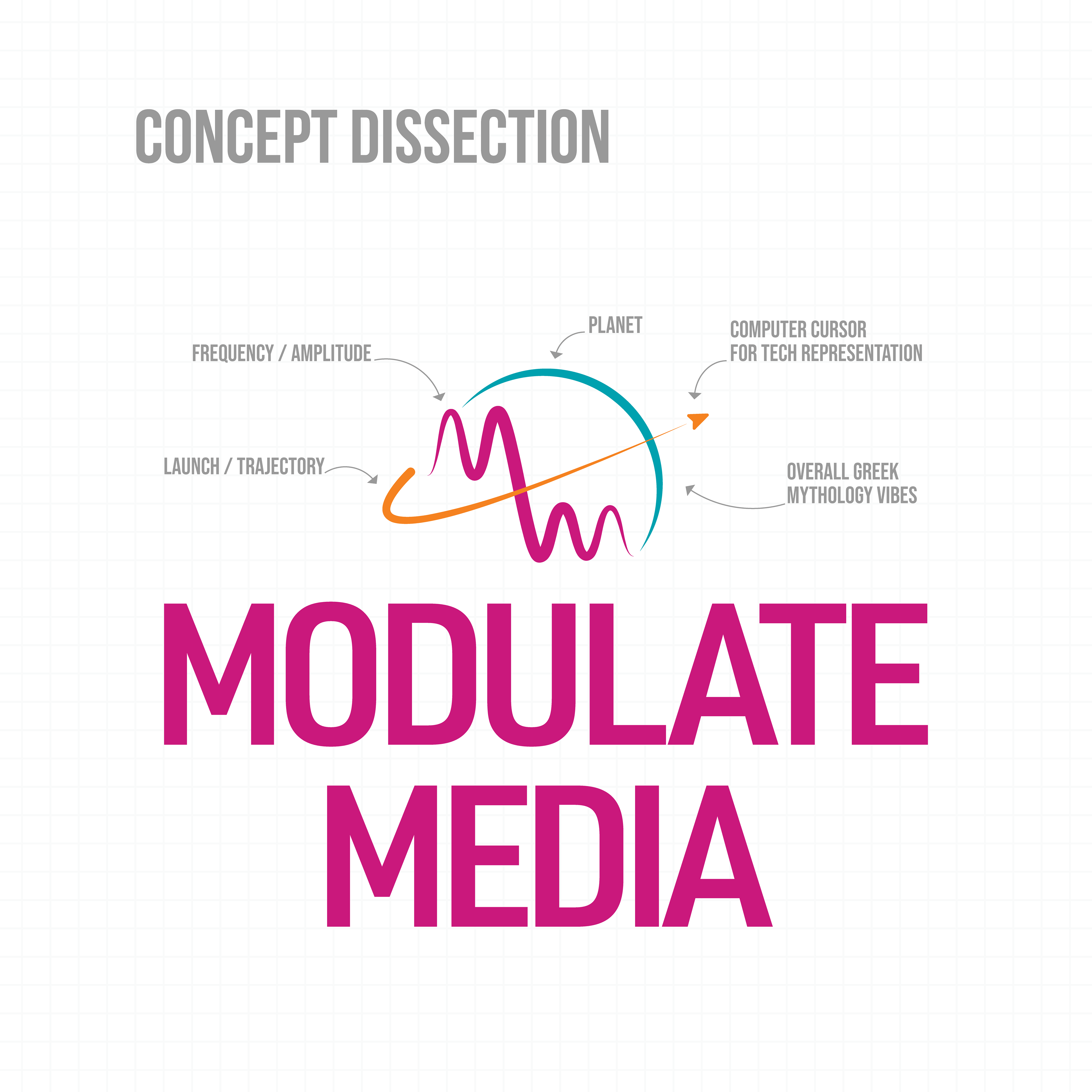
I mapped out the elements that directly related to the company's mission and vision: "We engineer signals that can’t be ignored." Mapping out the "M's" as an element of amplitude from an oscillation graph worked well for the name "Modulate Media". We had a trajectory path to display around Earth and our rocket ship was a computer cursor icon that represented the tech industry and our technical capabilities through design methods. The final icon also evoked a Greek mythology-like aesthetic that is only enhanced when used as a one-color icon, as seen in the Earthrise photo lower on this page.
When crafting the color palette, I wanted to make the vibrant colors were capable of working in multiple different ways; one where Spicy Space was the main color and one where Inky Onyx dominated a screen or asset.

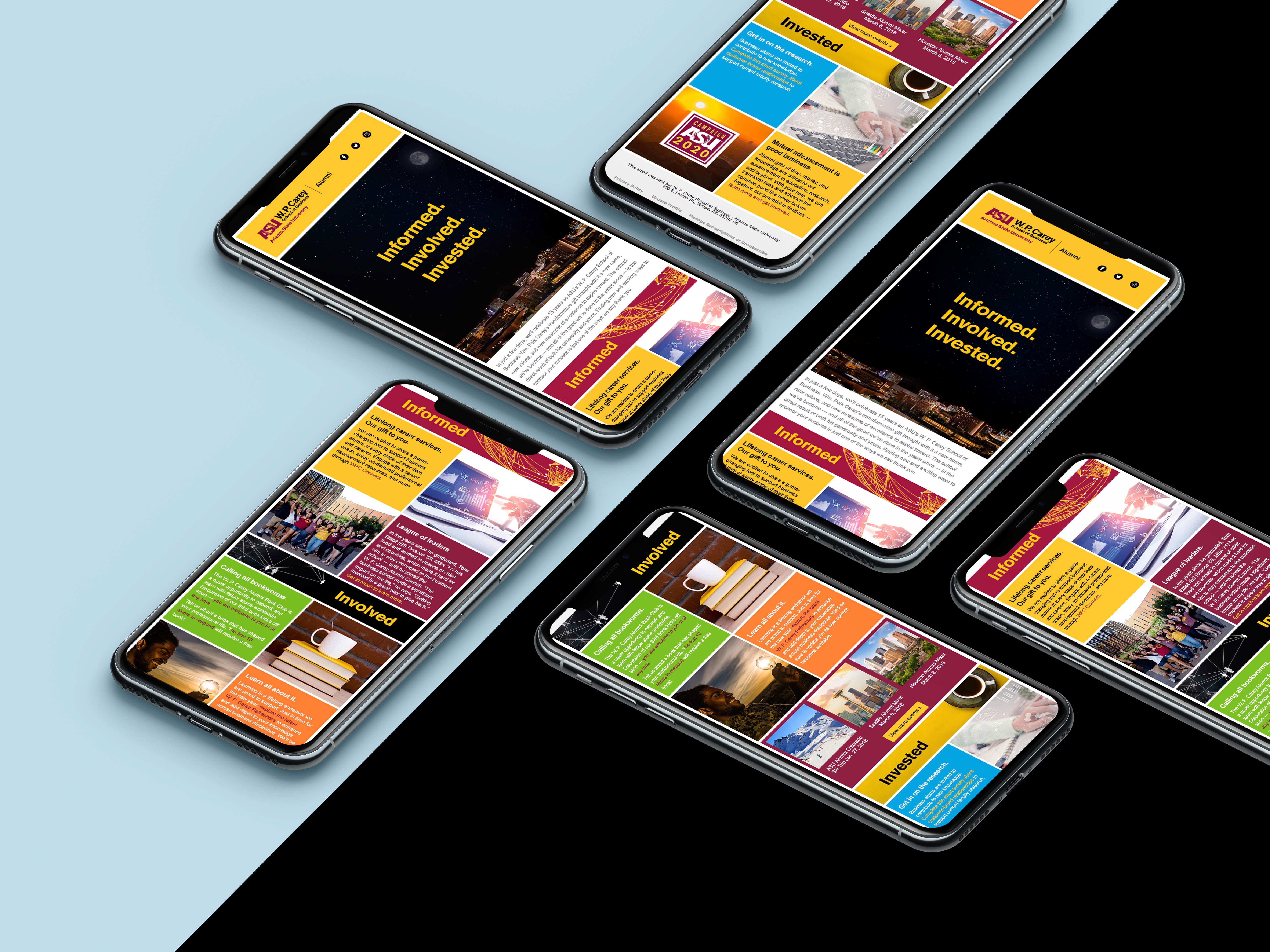
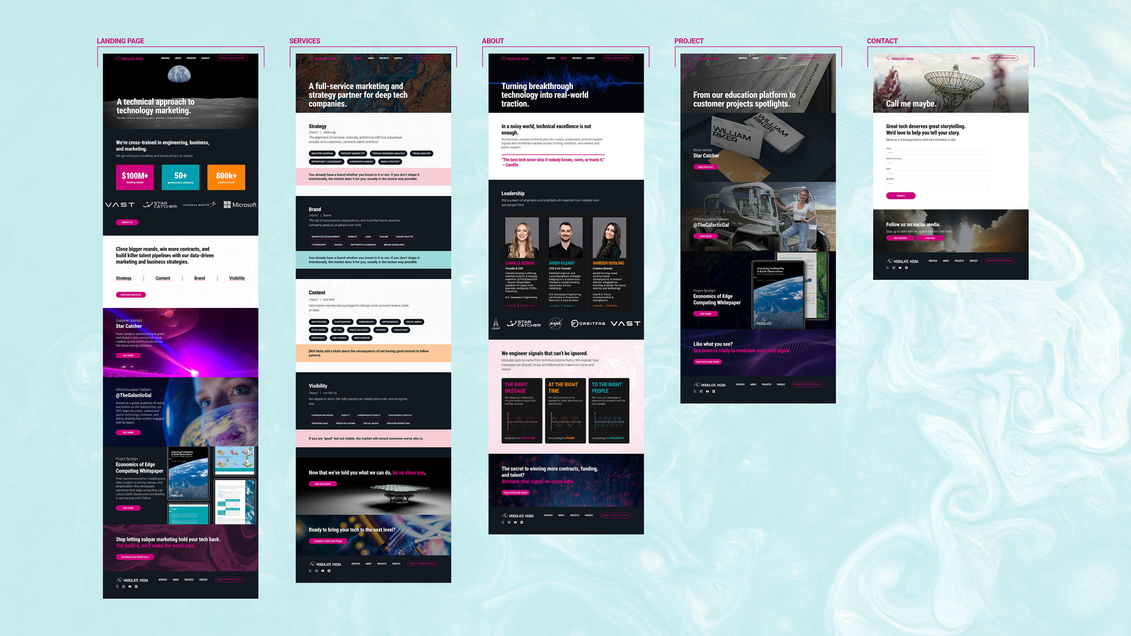
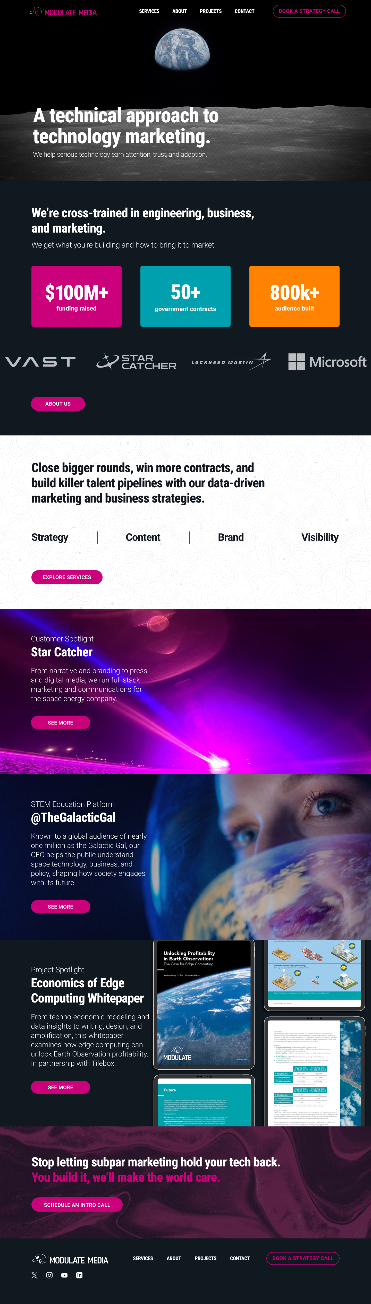
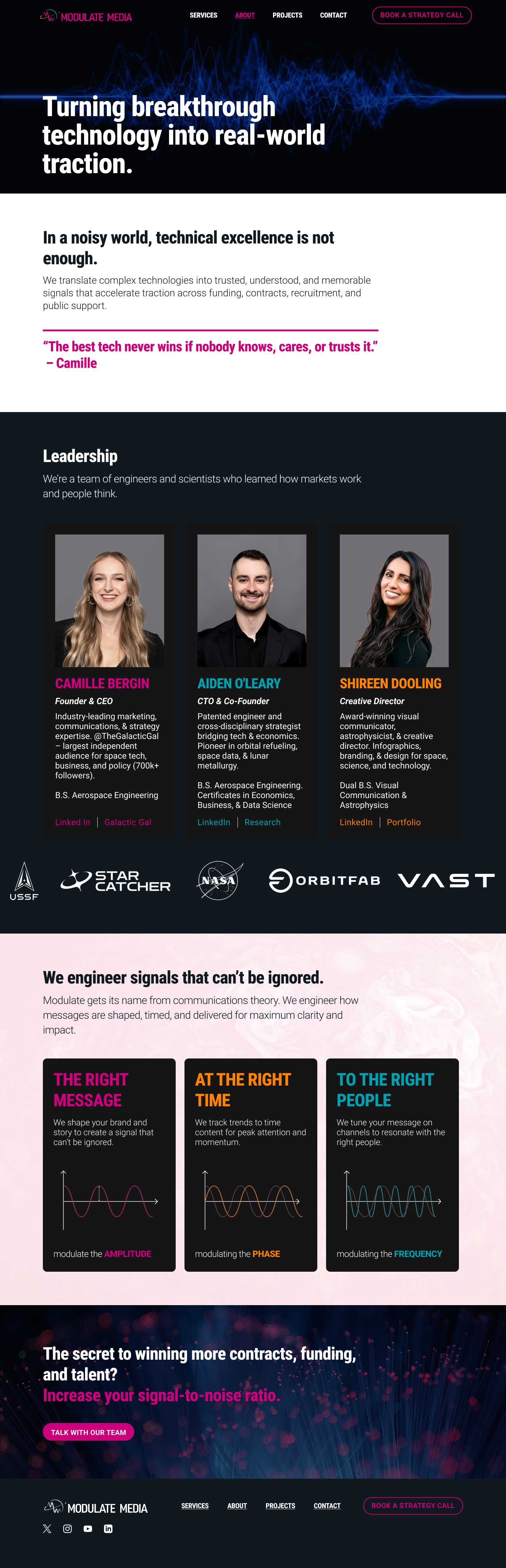
The website design was created in Figma and developed in Framer. I created several animations and clips to be used on the site as project highlights for Modulate Media adding visual interactivity to the site without over engineering the functionality of the site and losing translation across devices as can sometimes happen when going from desktop to mobile.

I designed Modulate Media's business cards to feature the primary color palette. Each set of business cards had three fronts and the logo and tagline had a raised spot-gloss treatment applied to them for an extra texture appeal on top of the soft-touch finish.