The infographics below were created during the summer of 2023 at NASA Goddard's Space Flight Center for the Hubble Space Telescope Outreach Team. These graphics were to be included on a webpage about spectroscopy and the instruments the Hubble Space Telescope has on board.
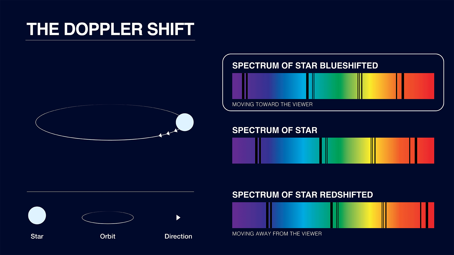
This gif illustrates a basic version of what is happening with the observed spectra of a celestial body moving towards and away from the viewer.
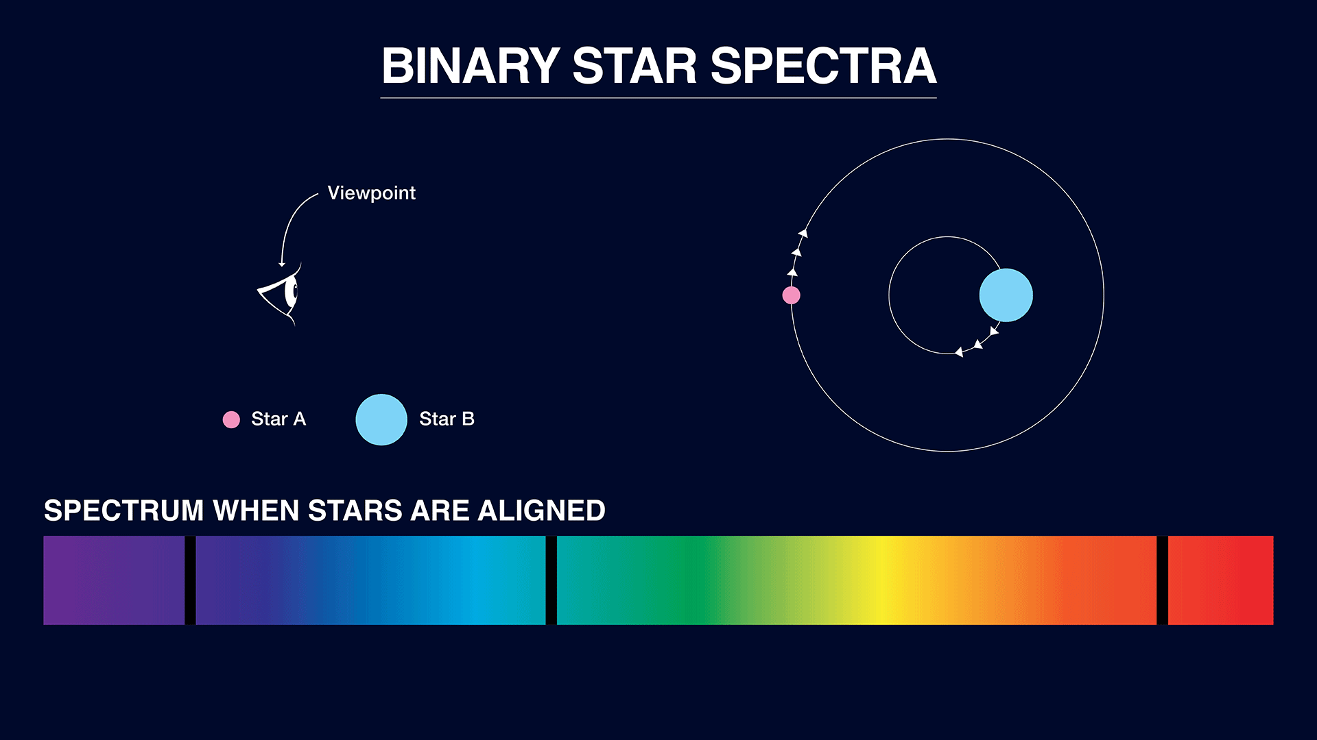
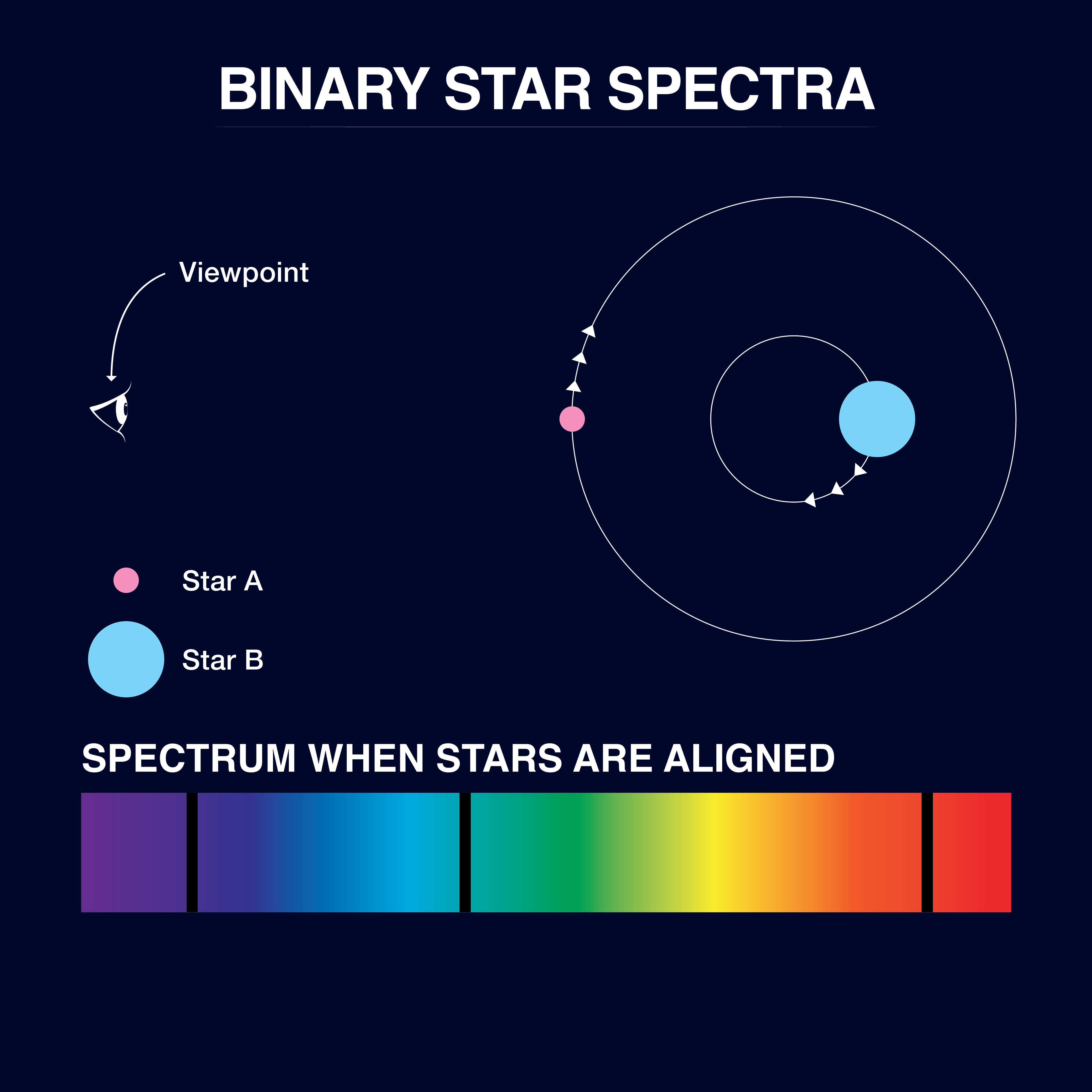
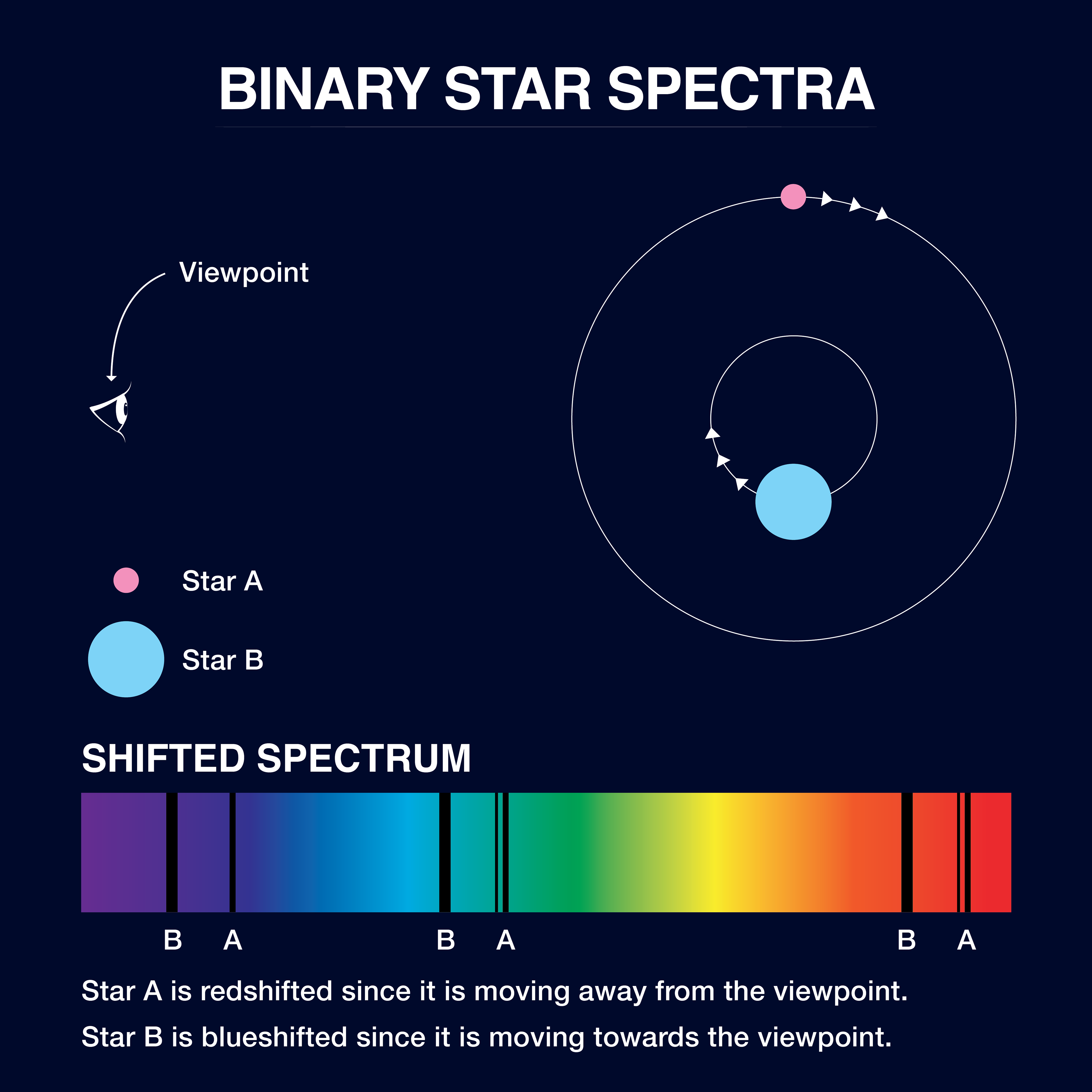
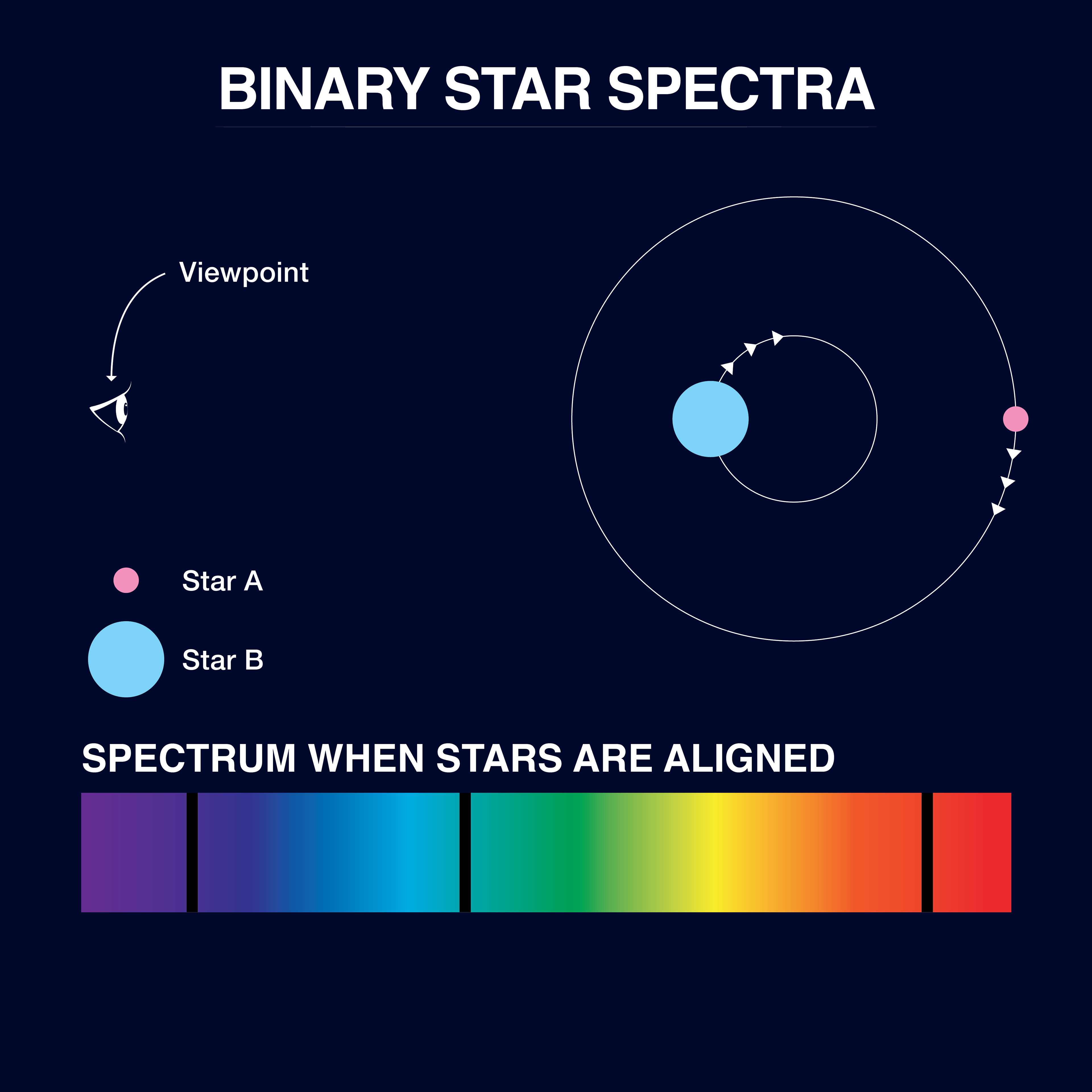
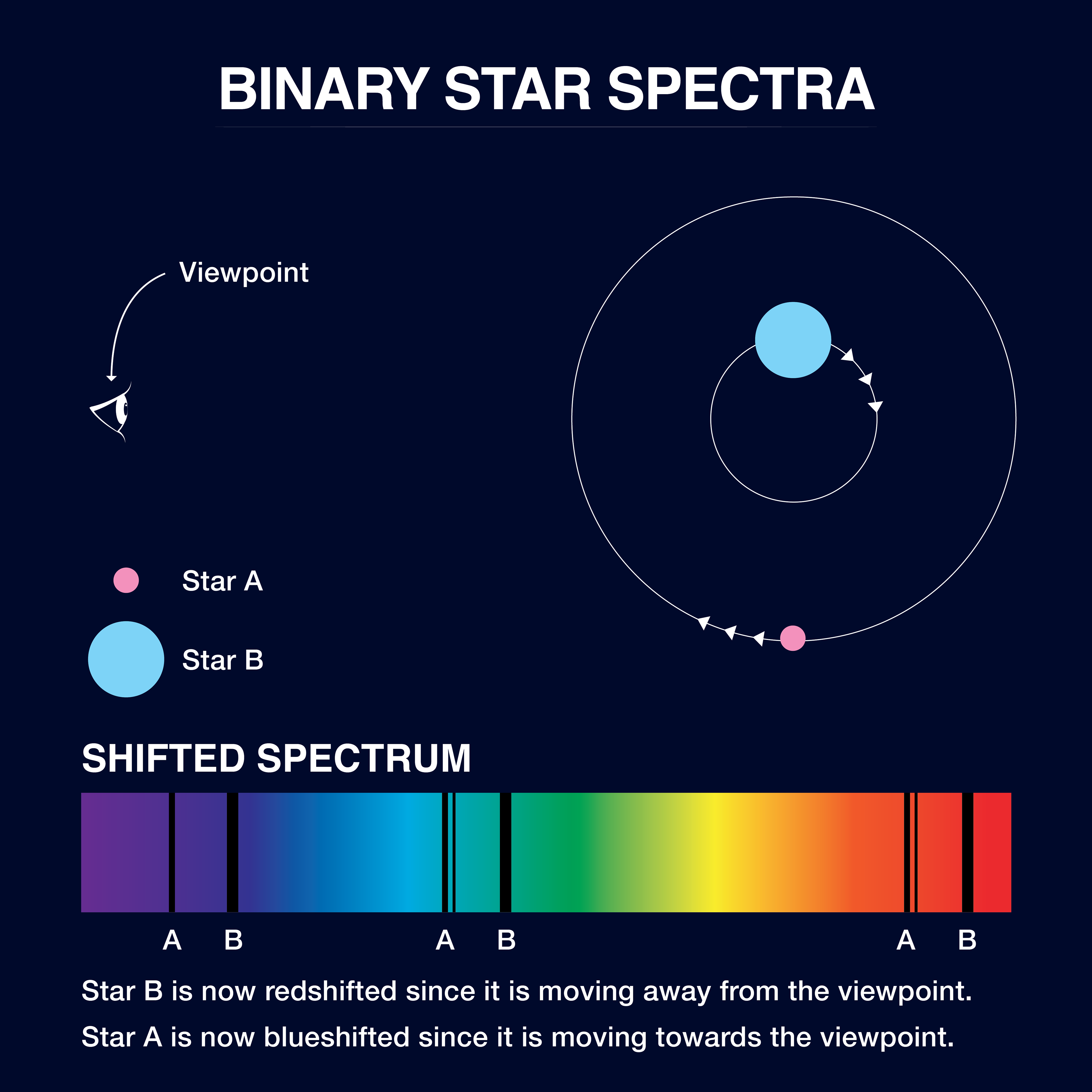
Graphics for the spectra of a binary star system were also requested. To accommodate the possible viewing styles, both a gif and a series of images were created. The images could be placed in a carousel allowing the viewer to take their time digesting the information, where the gif could showcase the movement in the spectra over time.
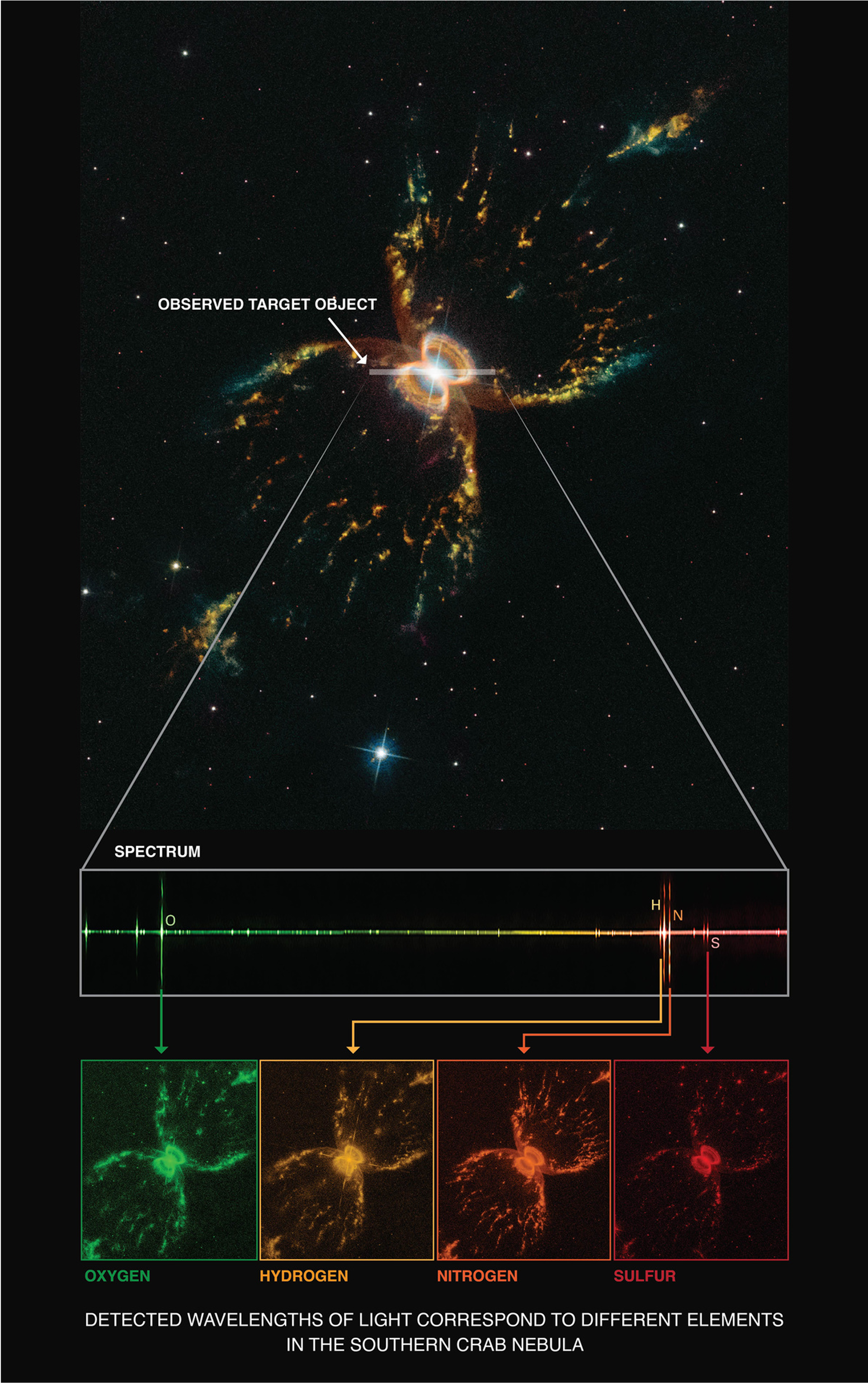
Using existing Hubble Space Telescope data and imagery previously created, the task for this image was to create a unified, visual connection between the image of the Southern Crab Nebula and the images of the spectra separated out into colors related to the spectra
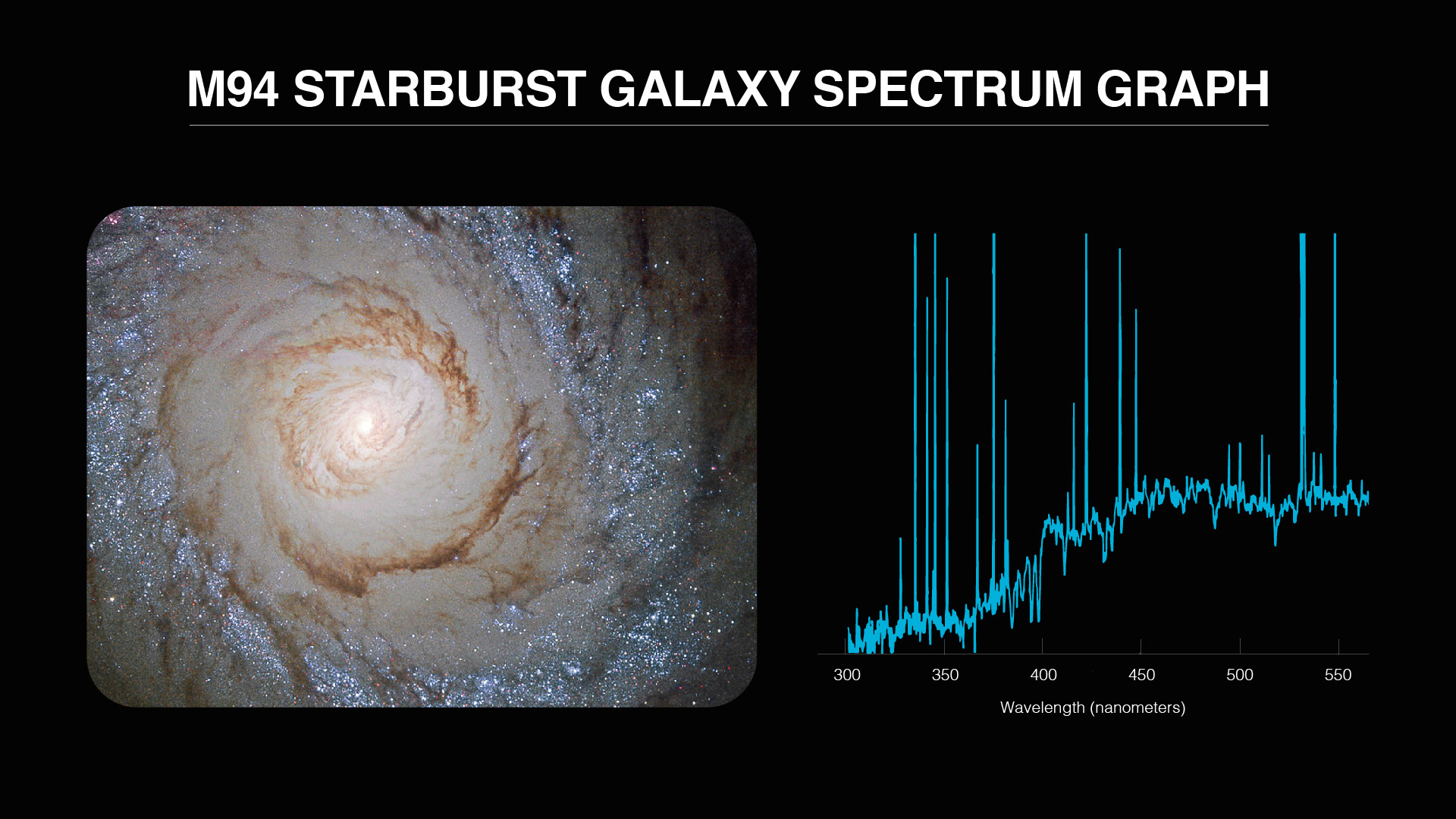
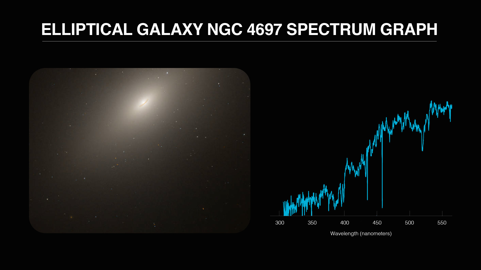
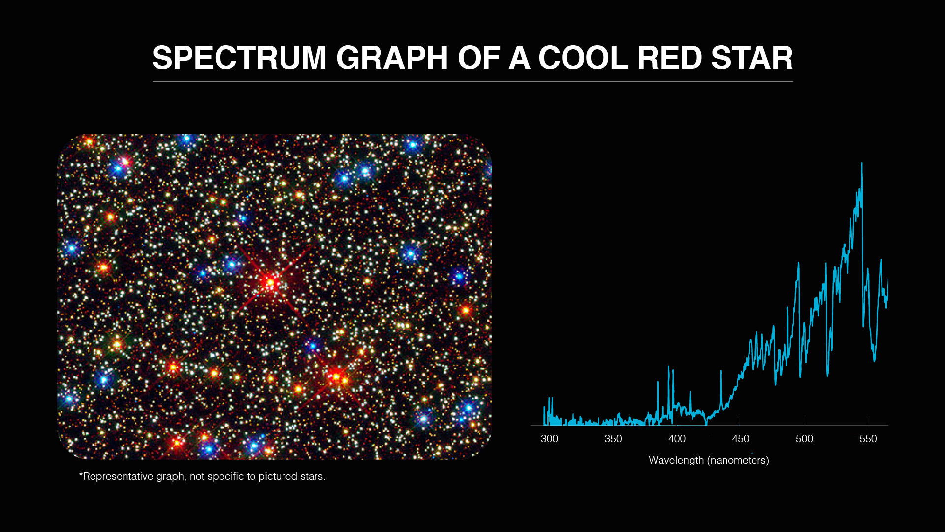
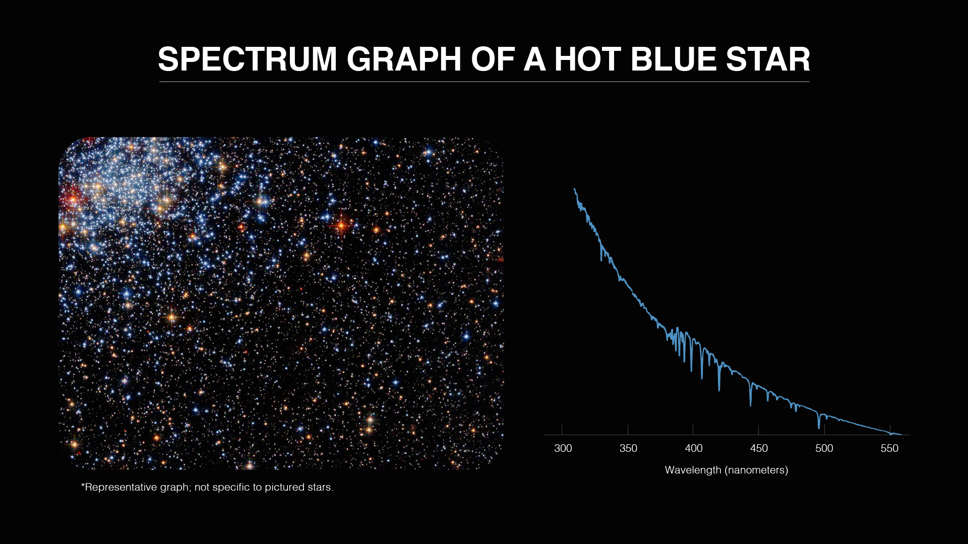
The purpose of these infographics were to show the general differences in spectra depending on the object being observed. Both a target and a spectra graph were supplied. The top two targets show their respective spectra graph readouts. The bottom two are representational spectra readouts of the shown targets.
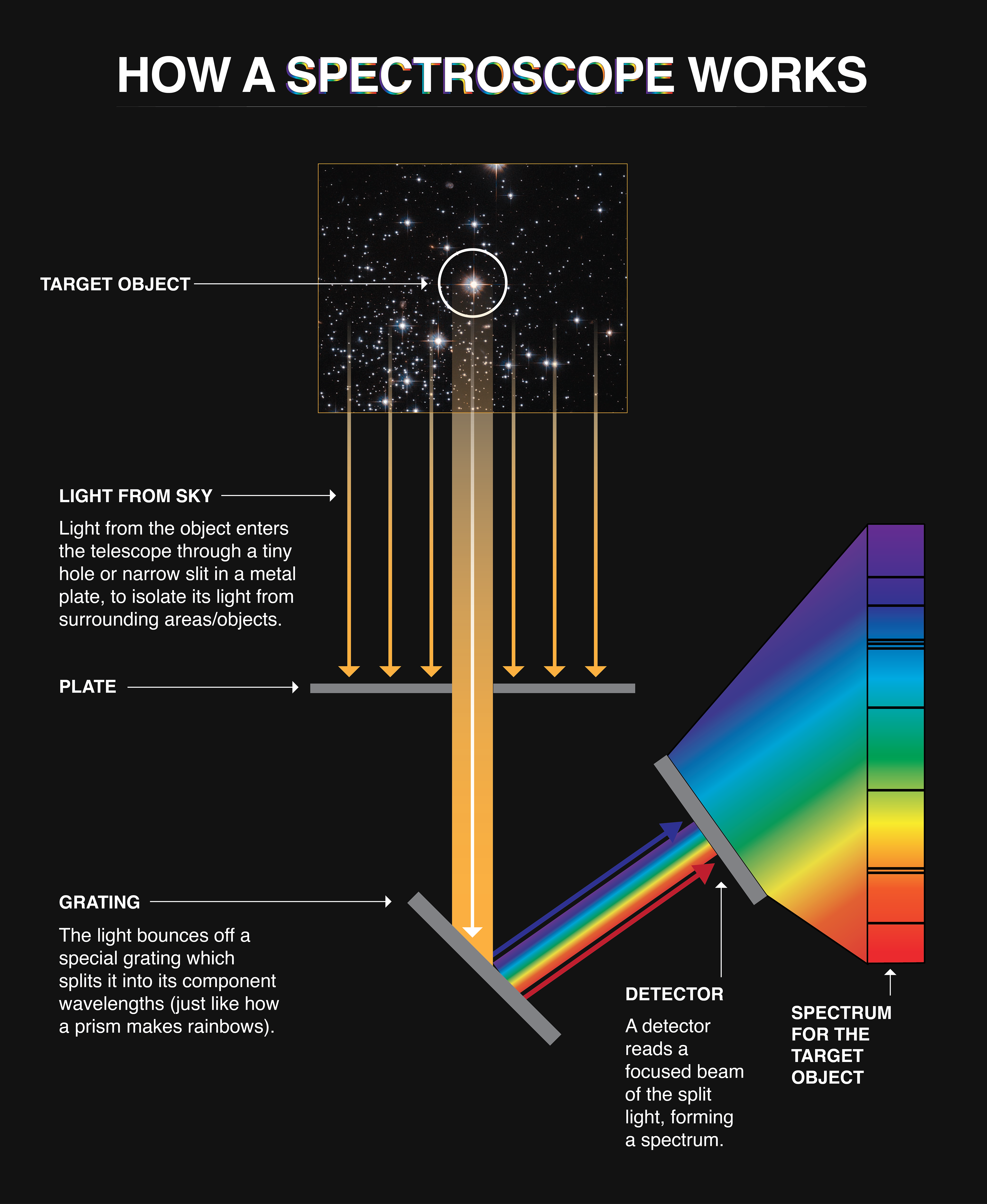
This infographic is a revision of an existing NASA infographic. A redesign was requested in order to match the new graphics that had been designed. During the process, refinement of the content was also addressed.